Apple’s latest and greatest innovation for the iPhone 16 is the Camera Control. This new button features several layers of software integration, and Apple thinks it adds state-of-the-art camera functionality.
The company calls this feature a “result of thoughtful hardware and software integration, which elevates the camera experience on the iPhone 16 lineup. It is packed with innovation, including a tactile switch that powers the click experience, a high-precision force sensor that enables the light press gesture, and a capacitive sensor that allows for touch interactions.”
While this all looks great on paper, having a hands-on experience with this functionality with my iPhone 16 Pro Max has only been frustrating and unreliable. Sometimes you don’t press the Camera Control hard enough to quickly launch the Camera app. Other times you end up taking random photos while trying to navigate through the control options, such as zoom, exposure, or depth of field.
Those are both common experiences I’ve had this past week. On top of that, pressing the button to snap a photo often causes the phone to move as it captures an image. At best, that means the picture doesn’t end up framed how you wanted. At worst, it might even end up being blurry.
Tech. Entertainment. Science. Your inbox.
Sign up for the most interesting tech & entertainment news out there.
By signing up, I agree to the Terms of Use and have reviewed the Privacy Notice.
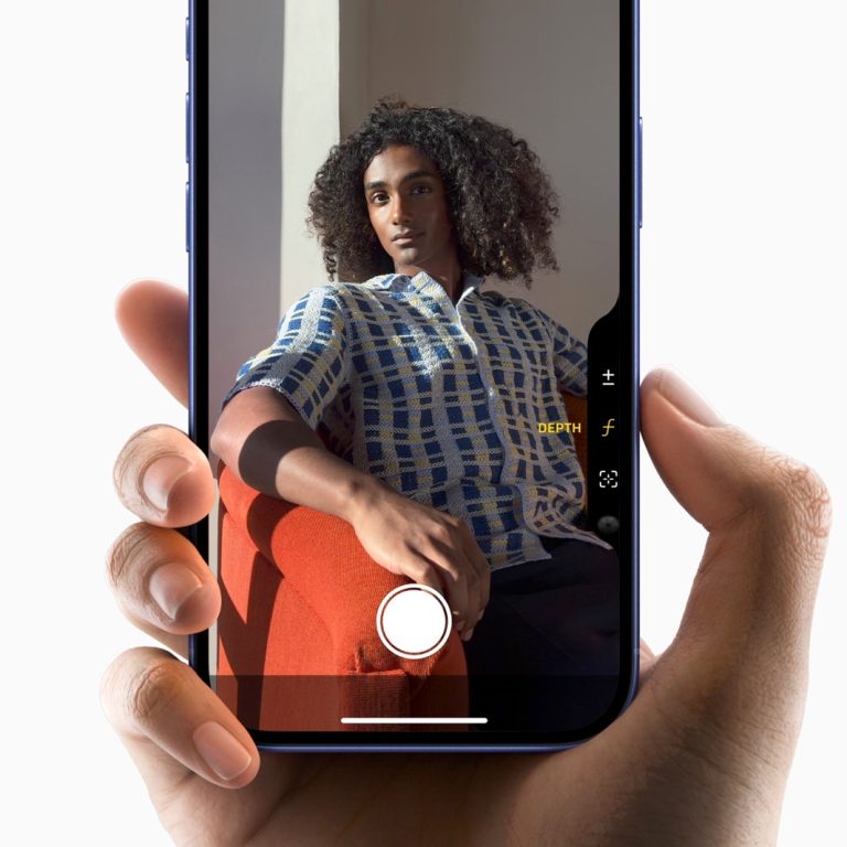 Image source: Apple Inc.
So far, the iPhone 16 Camera Control functionality feels like a solution to a problem no one had. The Camera app is already overcomplicated, and adding a second physical interaction layer only makes matters worse. There are a few examples of why this feature’s real-world use case is so bad:
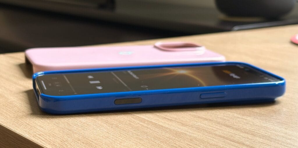
- Misplacement: The Camera Control is poorly positioned, and I don’t think there was a good place to put it. With the iPhone 16 Pro Max, it would look better just below the Side Button for vertical shots. However, it’s slightly more comfortable in the position it is for horizontal shots – except no one shoots horizontally!
- 3D Touch-like experience: Do you remember the iPhone 6S’s 3D Touch functionality? Well, Apple eventually disabled this feature in one of its latest software updates, even though the iPhone XS still supported it. With the Apple Watch, Apple also removed the Force Touch for different gestures. The reason was it was overcomplicated for regular users to get it. So, why did they add a 3D Touch-like feature to a small button no one can reliably press?
- Too many settings: AI mentioned above, the Camera app already offers many customization options if you want the perfect shot. However, it’s easier to slide your finger rather than press and swipe through a small UI in the right corner.
- Muscle memory: I was excited about the Camera Control, so I could ditch the Camera app button from the Lock Screen and use whatever other option I wanted. However, after years of pressing that button to open the camera, it’s hard to remember there’s technically a more convenient way to do that.
Finally, I would say regular users will just not use it. And whether Apple wants it or not, the iPhones are made for everyday users, not us tech geeks who wish for more buttons, customization, and crazy new features. The company already killed so much great functionality because it wasn’t reliable or misunderstood, and I think the Camera Control will follow the same path as 3D Touch, Force Touch, the Touch Bar, and other similar features, such as Slofies.
I hope Camera Control grows on me, but I’m unsure
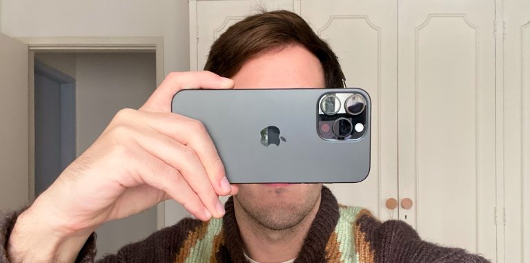 Image source: José Adorno for BGR
At the end of the day, you can just take your iPhone out of your pocket and take a shot. You don’t even need Camera Control for that. Maybe some users will find it more useful to open third-party camera apps or even take advantage of a fancy AI feature coming later this year, which will let you identify breeds of dogs, save information to your calendar, and so on.
As with all new technologies, we need some time to get used to them. However, after a few tries, most users give up. For my profession’s sake, I’ll force myself to use it for longer. Will I realize it’s an amazing feature, and Apple was the only one that created a DSLR-like camera experience for mobile? I don’t know.
Even though I think it’s impractical, I would have loved it if the Camera Control worked like the Digital Crown, as it would definitely resemble a proper camera. However, imagine a Digital Crown on an iPhone. Absurd, I know.
You can read BGR‘s iPhone 16 review to learn more about the iPhone 16 and its new Camera Control button.

